17
Lauren Wordmark
ON-BRIEF
PROMPT
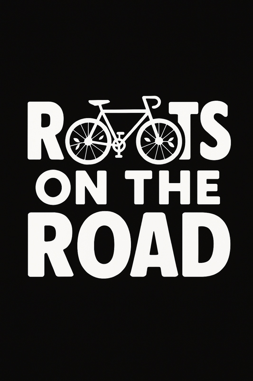
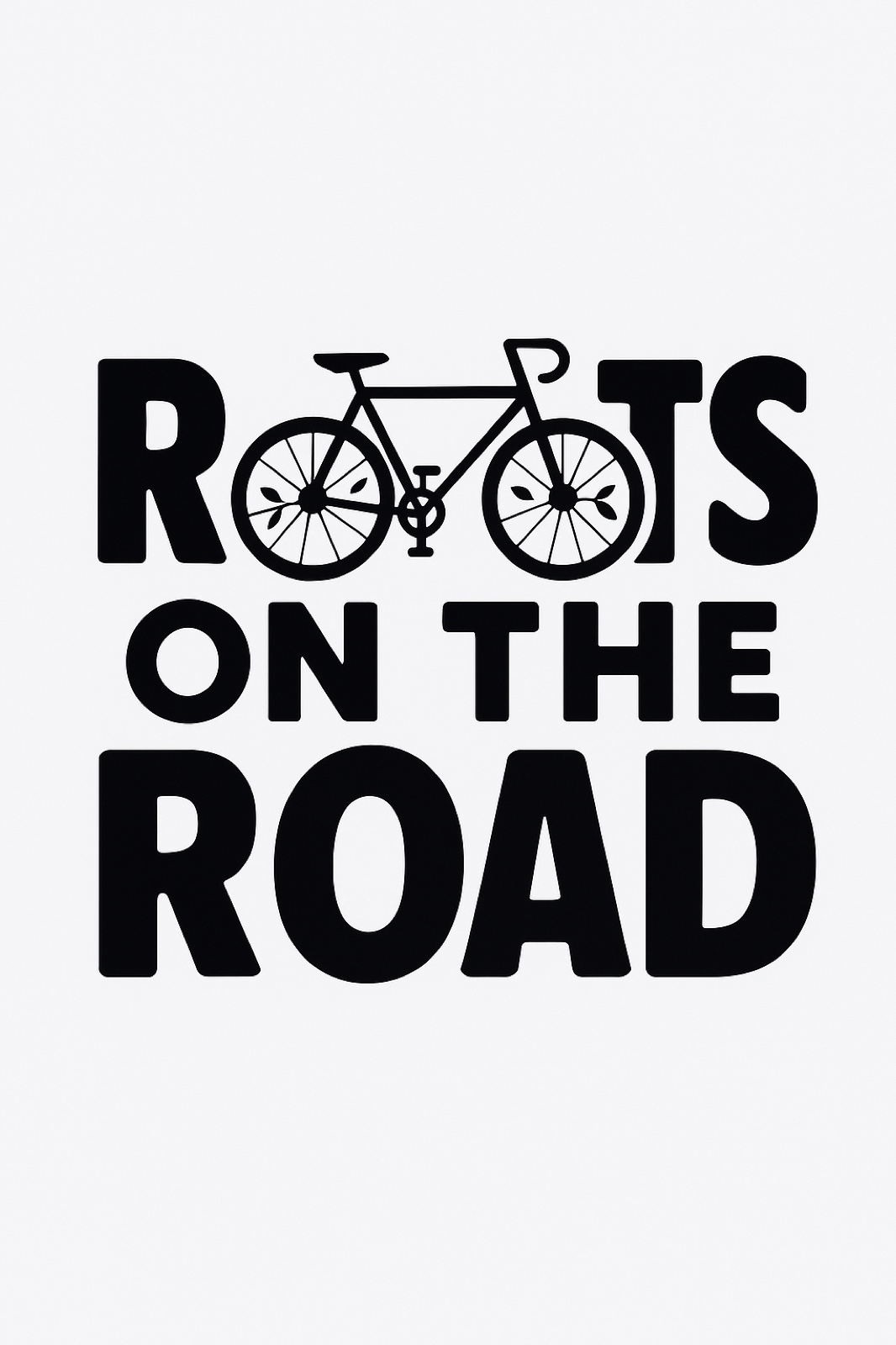
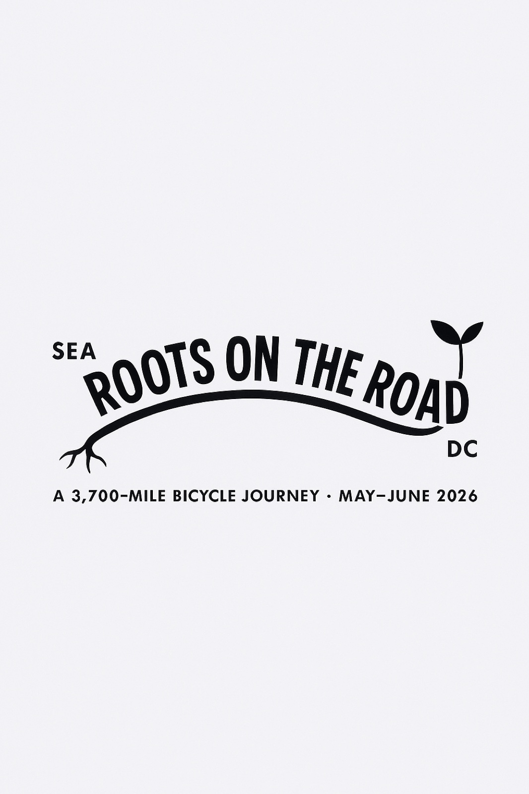
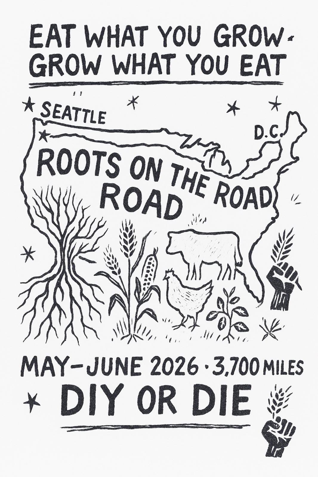
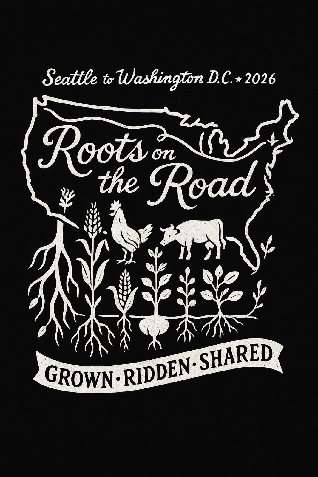
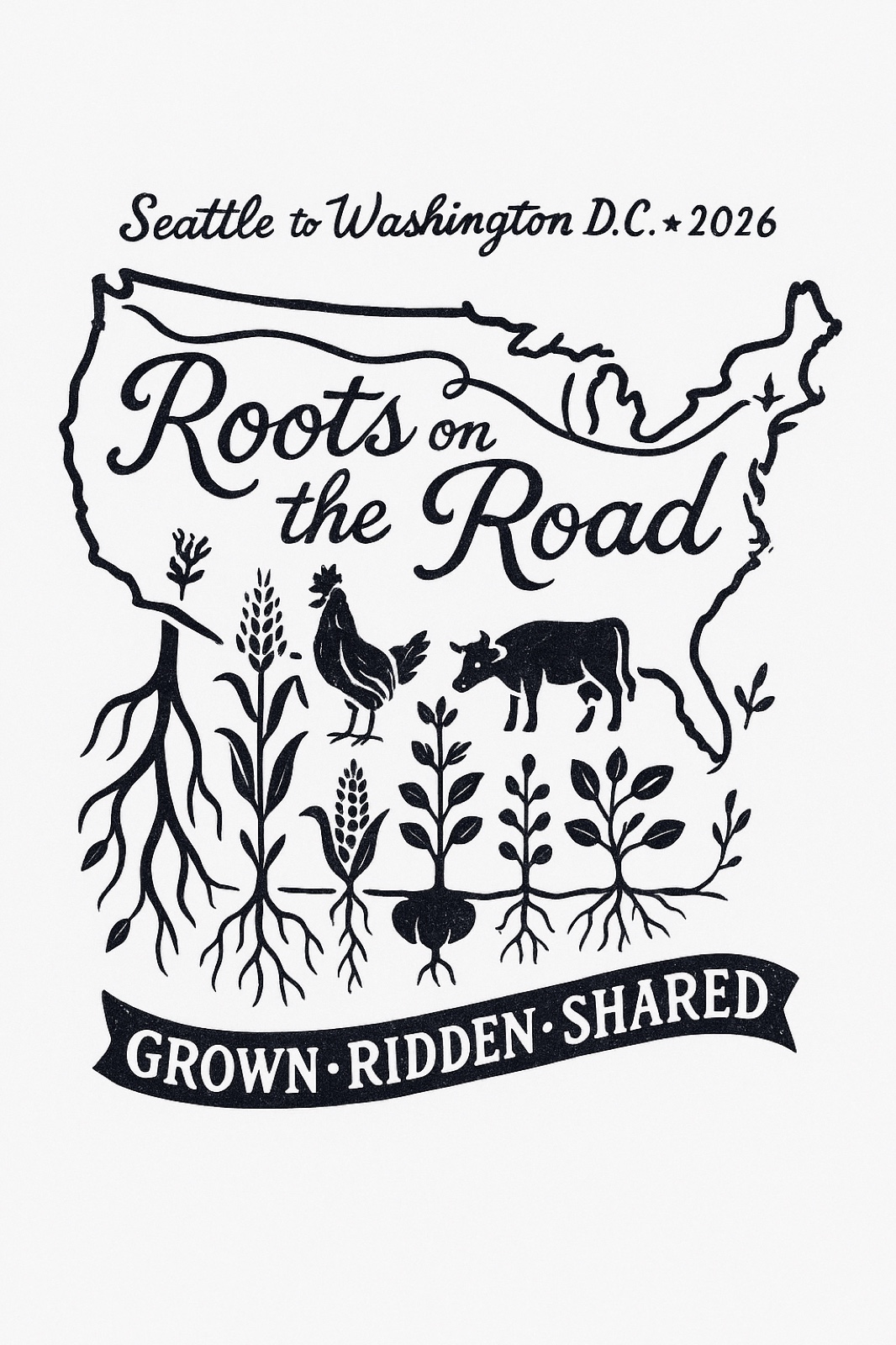
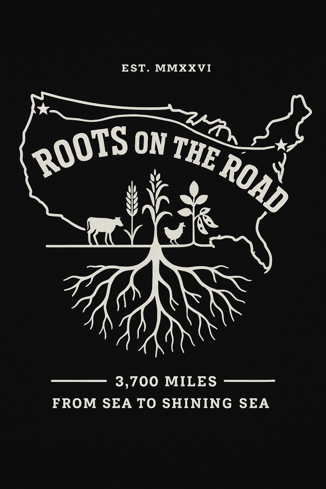
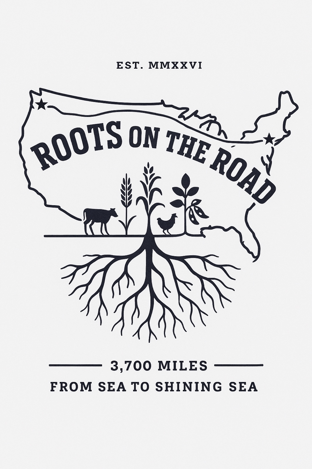
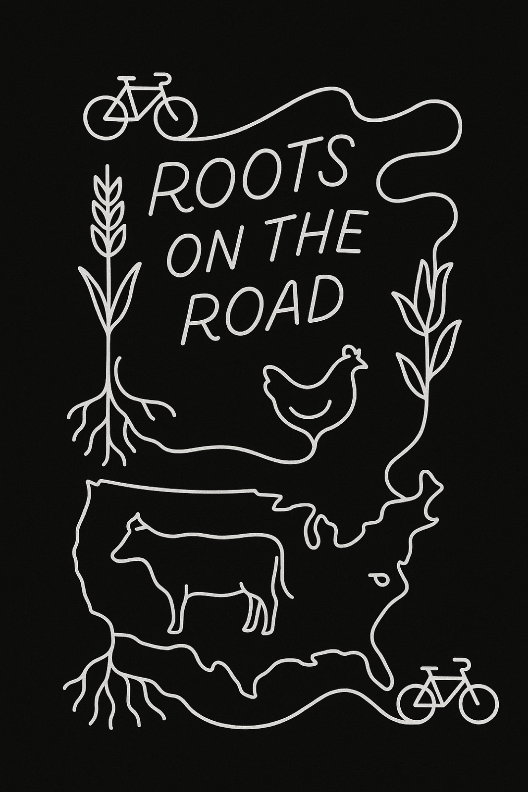
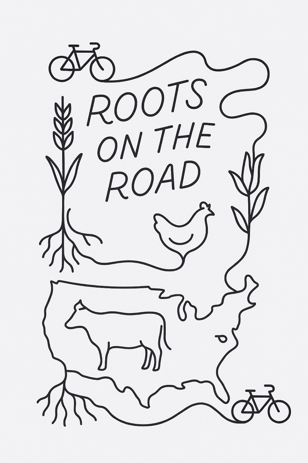
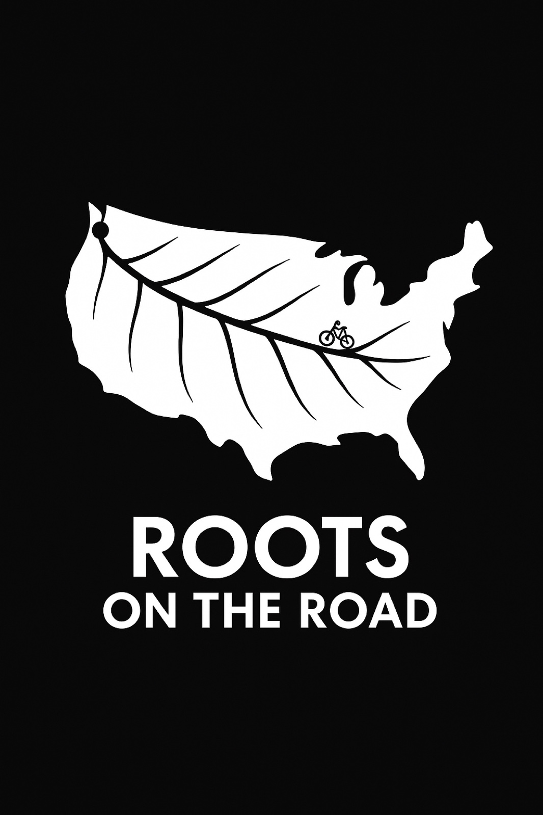
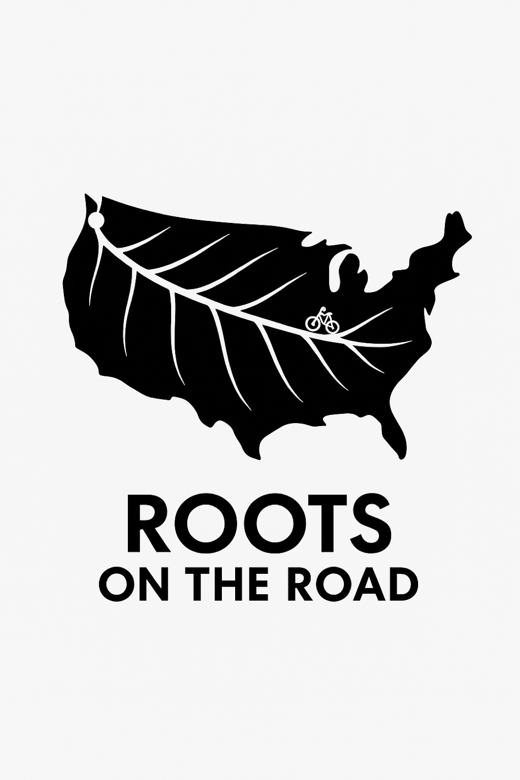
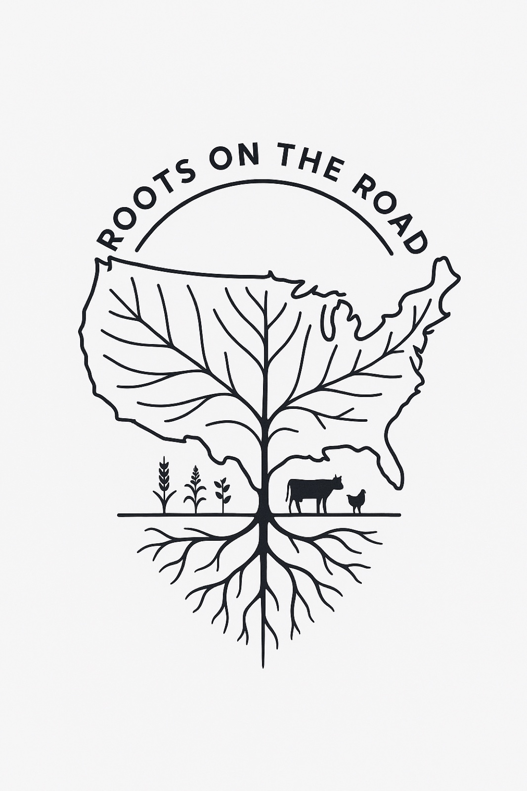
A single iconic typographic wordmark, centered on a solid pure black background. Square composition. The wordmark fills roughly 75% of the canvas, generously surrounded by black negative space.

Subject: a refined, professionally-executed reinterpretation of a hand-drawn wordmark concept. Three lines of type, all in solid white, all caps:

Line 1 (largest, top): "R [bike-wheel] [bike-wheel] T S" — the word "ROOTS" where both O's are replaced by stylized bicycle wheels viewed dead-on. The wheels are perfect white circles with thin clean spokes radiating from a small white hub, and from the tips of two of the spokes on each wheel, tiny stylized leaves emerge (one leaf upper-right, one leaf lower-left). The wheels match the cap-height and stroke-weight of the surrounding R, T, S letters perfectly.

Line 2 (smaller, middle): "ON THE" — set centered.

Line 3 (large, bottom): "ROAD" — set centered, matching the size and weight of "ROOTS."

Typography: a confident chunky modernist sans-serif, somewhere between Cooper Black-meets-Futura — soft, friendly, but disciplined. NOT a default system font. The letterforms have personality but stay geometric. All three lines feel like one unified family.

Strict design constraints: pure flat solid white vector shapes on solid pure black background. NO outlines, NO gradients, NO color, NO photographic elements, NO additional decoration, NO drop shadows, NO additional text. The wheels and the letters are the entire mark. Aesthetic references: Paul Rand's Cummins logo, Herb Lubalin's typographic plays, the original Whole Foods wordmark, contemporary independent farm and brewery branding done by Pentagram or Hoodzpah. Reductive. Witty. The wheels-as-O's pun does all the work.
A single iconic typographic wordmark, centered on a solid pure black background. Square composition. The wordmark fills roughly 75% of the canvas, generously surrounded by black negative space.